CSS Grid Doubledash
Today, we’re going to learn about CSS grid through one of the most iconic franchises of all time.
Here we go!
The power of CSS Grid v. Flexbox is the power of formatting elements in columns AND rows v. columns OR rows. You’ll see what I mean shortly.
We will start with a basic HTML file including a parent div (‘players’) and then individual div’s for each player.

Regarding starting CSS, I set max widths and heights for the images to ensure that they were responsive and would be contained inside each of their individual divs. I then provided a set height for the trio.
The first thing you need to do when setting up a CSS grid is declare the grid on the parent container. Therefore, on my ‘players’ div, I will add:
display: grid; Grid Row and Grid Column


Choosing rows and columns are crucial to your CSS grid. You can set the number of columns you’d like as percentages. For example, if you’d like to set 3 equally sized columns.
Beyond percentages, you can also use fractions to divide up a grid:
grid-template-columns: 1fr 1fr 1fr; //divided up equally 

You can even set specific destinations for where you’d like elements to start within the grid.
Here, you are stating that you’d like Mario to start on the 2nd column and end on the 3rd. Because of the order of the HTML, that would push the next two elements down.


To illustrate this using one more example, let’s say you wanted to use Mario as a header across the top. The 4th column indicates the end of the grid and you are starting at the beginning.
To add manipulation of the rows, you first need to indicate some row options back in the parent container.

Now, beyond the 3 equally sized columns, we will have two equally sized rows from top to bottom — we’re switching the height from individual players to the container as a whole — 2 50% rows on a 20rem container = 10rem per row.

Now, playing with both the columns and rows, you can see we can manipulate the players across the 3x2 grid.

Shorthand
To make things simpler, CSS grid has shorthand options. First, to declare a grid layout on the parent container, you present rows, then subsequent columns separated by a ‘/’
grid: 50% 50% / 33.3% 33.3% 33.3%;The above would create a grid with two rows taking up 50% of the height and 3 columns that each take up a third.
You can also use repeat as a shorthand. Using the same numbers as above:
grid-template-columns: repeat(3, 33.3%);
grid-template-rows: repeat(2, 50%);
You can also use repeat in conjunction with a declared value:
grid-template-rows: 50% repeat(2, 25%);//would be the same as
grid-template-rows: 2fr 1fr 1fr;
This would result in 1 row that takes up 50% of the space and 2 rows each taking a quarter.
Finally, you can combine repeat with the original shorthand:
grid: repeat(2, 50%) / repeat(3, 33.3%) //2 rows with 50% and 3 columns with a third
For individual elements, there is also a shorthand instead of using start and end. For example, if you wanted an element to start at column 3 and end at column 4, you would use:
grid-column: 3 / 4; Indicating an element’s grid row spread uses the same syntax:
grid-row: 1 / 3; Grid-area applies rows and columns in the same line. It is organized as:
row-start / column-start / row-end / column-end
grid-area: 1 / 3 / 3 / 4//is the same as
grid-row-start: 1;
grid-row-end: 3;
grid-column-start: 3;
grid-column-end: 4;
Grid Auto-Flow — row (default), column, dense

From the onset, you see that default flow is left to right across rows. Grid auto-flow allows you to change that direction. So if you had 2 rows and 3 columns but reset the auto to column…


You can still indicate specific rows and columns for elements.

Dense allows you to essentially fill in any gaps.


Grid Template Areas
You can indicate specific areas of your grid with names.

With 2 rows and three columns, you are essentially just drawing out your grid.


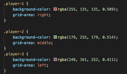
Then for each element, you can indicate where you want to position in using grid-area.

This is extremely powerful when you want to do something more detailed.
Gap
Creates minor separation between the grid areas — a simple alternative to margin or padding.


You can also specify between rows and columns:
grid-row-gap: 2rem;
grid-column-gap: 1rem;
Auto-Fit and Auto-Fill
These keywords allow you to control the grid in different ways. Auto-fit allows you to repeat a specified element size until it fills up the grid container.
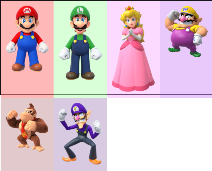
Let’s say I added an additional 3 players to the grid.

I could give the grid a height of 200px and tell it to continually create columns at 100px until it completes the grid.

Each division will be 100px until you reach the end.

It will be responsive, so if I stretched the grid, we will need more columns.

Auto-fit on the other hand is similar, but only generates the amount of columns needed.
grid-template-columns: repeat(auto-fit, 100px);
As you can see, the columns end at the last player. The responsiveness of these properties are important because they can often be substituted for media queries — instead of changing the grid per screen size.
Last quick tip is the minmax property — as you can see when you adjust the screen:


There can be whitespace on the right side as the elements adjust. If you uncomment the last line of code above, you can see minmax allows you to pass a minimum and maximum width. Therefore it can adjust as needed.

Hope you enjoyed this post!
